
Heavy Metal
Distributor: Columbia Pictures
Studio: Guardian Trust Company, Canadian
Film Development Corporation and Famous Players
Individual Segments Created By TV Cartoons, Halas and
Batchelor Cartoon Films, Atkinson Film Arts, Haines-Camron,
Votetone, Boxcar Films and Wally Bulloch-Anicam
Director: Gerald Potterton
Producer: Ivan Reitman
Original Release Date: August 7, 1981
Since I went over the storyline and the history of the film, let's take a look at the individual segments and their qualities. First off, "Soft Landing". All we really see in this segment is a poorly rotoscoped Corvette. I can tell that was a real Vette they shot, the rotoscoping can't hide that. Next up, "Grimaldi", the story that strings the segments together. Like I said, Heavy Metal's story is nothing special. It's uneven and it just serves as a crutch for the novelty: The sexual content, the effects and the overall experience. Turn your mind off and enjoy the ride. "Grimaldi" features unspectacular animation and art direction, but criticizing this is a bit unnecessary, as it's only there just to tie these stories together. The filmmakers could've done the film in the same way Fantasia was done, but without someone introducing the segments. That would be a bit awkward and uneven, but it would've been an interesting experiment none-the-less. Perhaps tying all of these segments together with a simple story was the best thing to do.
 "Harry Canyon" is brought down by poor character animation and scratchy art direction. I understand that they were going for a gritty look for a dystopian New York City, but the art direction lacks any excitement. It's bland. Most of the character animation... Well, I should say the rotoscoping makes the character movements stiff and sometime laggy. To me, rotoscoping is a no-no when it comes to character animation. Ralph Bakshi's The Lord of the Ringscertainly proved this three years before this film hit theaters. Snow White and the Blue Fairy taught the Disney animators a lesson, though rotoscoping would be used for other things (such as vehicles, effects, etc.) in Disney films while not looking unconvincing.
Yet rotoscoping was the big thing in the adult animation world. (Or should I say animated films that got R ratings without actually being "mature") Don Bluth seemed to love rotoscoping as well. It was a rather unhealthy trend to say the least, and it plagues Heavy Metal, big time! The "Harry Canyon" segment is one of the worst offenders. Aside from the animation/rotoscoping work on the human characters, the animation on everything else is laggy such as a car chase, which should be exciting. Unfortunately, the stiff animation holds it back from being thrilling and just ruins it. Poor animation quality aside, "Harry Canyon" is a good segment because of the storytelling. It's a short, simple noir story set in the future with decent writing and acting.
 The character animation is slightly better in "Den", but still unconvincing. It seems like that $9 million budget (a huge budget for a non-Disney animated film at the time) was only used on the special effects and art direction, since "Den" and most of the other segments boast these qualities. "Den" has colorful art direction, far better than the work seen in "Harry Canyon". Some of the effects look fake today, such as the psychedelic skies, but I bet they looked cool in 1981.
"Captain Sternn" doesn't go for a realistic look, but a rather cartoony one. The characters have very cool designs. Sternn has a big square jaw, his lawyer looks like a rat, and Hannover's gimpy nature is captured perfectly. The character animation here is better than most of the segments in the film, but the movements are still laggy. A scene where some of the space station crushes flows just as badly as the car chase in "Harry Canyon".
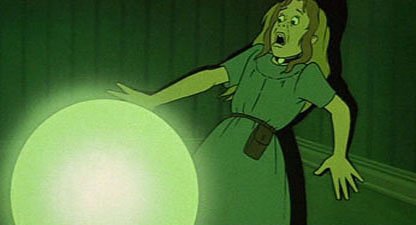
"B-17" is jam-packed with rotoscoping. The bombers were models, and you can tell, but I do admire the work that went into making the models since they were big. (The DVD bonus features shows how big they were!) This short works because of the shear creep factor of it, Elmer Bernstein's score and the writing. It's pure horror, and it would work as a horror short. The battle scene that kicks off the segment is almost intense, the only thing that holds it back is again... The stiff animation and movements.

"So Beautiful, So Dangerous" contains the best animation and art direction in the whole film. Everything looks top notch here, close to being simply good. The animation never lags here, now slowing down or speeding up. The special effects are convincing, particularly when the aliens trip out on Plutonian Nyborg. It's a very colorful segment, with loads of small details. Some backgrounds had holes cut in them and put colored gels behind them to make them look like they were actually lit up. One issue I have with the story is that there really isn't any, although the segment was meant to be a lot longer. The segment opens with Dr. Anrack, who enters the Pentagon to discuss extraterrestrial life with the politicians. It turns out that he's a robot sent there by the aliens, that's why Gloria gets sucked into the ship. Then the story pretty much takes a back seat to the aliens' hallucinations and robot sex.
The only big problem with this sequence, technically, is the huge editing error at the end. The sequence plays out like this. Gloria and the robot exit the spaceship, but the next scene shows the aliens crash-landing at a space station. In the rough cut of the film (which is on the DVD and Blu-ray), the aliens crash-land first, then Gloria and the robot exit the ship. What the hell happened there?! Aside from the technicalities and the animation, "So Beautiful, So Dangerous" is the funniest segment in the film.
"Taarna" is an epic segment, the basic revenge story with some bloody fight scenes. Unfortunately, this segment is ruined by, yet again, the animation. Taarna herself is an actress that was rotoscoped, and it doesn't look good. The art direction on the other hand is alright, but the rotoscoping and the movements are bad. The whole fight between Taarna and the barbarian leader loses a lot of its potential due to the laggy movement. Also, look at the scene where the barbarians invade the city. At times they're running like they're in slow motion, then in the next scene, it looks like everything was sped up. It takes away any intensity that this scene should have. It. Just. Does. Not. Work. The effects animation is a whole other story.
 When Taarna flies around on her giant bird, we are treated to a three-dimensional flight through the realm. Models of these canyons and deserts were built. The animators traced over the footage. I admire the work that went into these models, but unfortunately, it's choppy on screen. Still, the fact that they went through all of this just to make a three-dimensional flight scene is still fascinating, especially before computer animation was used in hand-drawn films. Then watch Richard Williams' The Thief and the Cobbler, which has several scenes that look like they were done with computer animation but weren't from the 1960s and early 1990s, that look better than this scene in the film. Still, it was a rather groundbreaking idea that did not really work. Hey, at least they tried! Even worse is the final scene where the Loc-Nar explodes and destroys the little girl's mansion. Since they didn't have enough to time to finish the scene, they didn't trace over the footage of the model house exploding.
Heavy Metal's animation is a definite mixed bag. Where it works, it works incredibly well. Some of the effects are great, some look fake. I can only imagine how audiences reacted to these effects in 1981, unless they just didn't think much of the work that goes into making animated films. The animation in "So Beautiful, So Dangerous" is very good for a non-Disney animated film, it's lively and colorful. Other scenes have great art direction. Where it doesn't succeed is... Well... Not very good. There's a lot of slow, lagging animation, as if someone slowed the film down. The rotoscoping is not good to begin with.
You'd think with the budget this film had, they'd produce some very high quality animation. Instead, most of the animation houses fell back on rotoscoping. I apologize to the animators and the artists, but I firmly believe that using rotoscoping for character animation just doesn't work! It didn't work in Snow White and the Seven Dwarfs, it didn't work in the Fleischer Brothers' works, it didn't work in Ralph Bakshi's films... I'll even say the same thing about performance and motion capture films! (Though Steven Spielberg's The Adventures of Tintin is the best looking performance capture film I've seen) It seems like that budget was just used on the special effects, though I imagine it was a big budget because of all the studios working on it.
So the character animation is hit-or-miss, but the art direction mostly isn't. "Harry Canyon" may look unexciting and bland, but the segments have their own unique style. "Den" borrows from fantasy artwork while still being trippy, "Captain Sternn" looks like a classic cartoon, "B-17" is dark and gritty, "So Beautiful, So Dangerous" is loaded with details and "Taarna" has a nice sci-fi/fantasy style.
The writing is also uneven, but it's mostly juvenile and it plays to the crowd who assumes mindless violence and cartoon breasts equals adult animation. Some of the dialogue is just downright campy as hell, in other scenes it's good enough. It's an average screenplay, that's pretty much it.
In part three, we'll look into what really elevates this film... You can probably guess what that is.
No comments:
Post a Comment